Last Updated on August 1, 2022 by Nala Thorpe

Dozens of digital banking apps enter the market every day. Some of them fail and disappear from the app stores, while others succeed and enjoy tremendous sales. What distinguishes these two app types? In most cases, it’s their UI.
A stellar user interface gives people satisfaction and ease of interaction; poor designs, in turn, cause nothing but frustration. As a result, companies that invest in UI harvest sales and user commitment, and those who neglect the importance of UI end up with market failures. Here is a brief guide on UI improvements for your banking app that can contribute to its market success and popularity.
What Does Good App Design Entail?
The secret equation of a successful app is a combination of visual appeal and functionality. This balance is tricky to achieve, often causing designer confusion. Thus, a path to stellar UI is typically cyclical, involving a set of iterations and changes. To arrive at an ideal UI design, you need to:
● Conduct thorough user research
● Introduce changes based on the user feedback
● Test your UI for usability and functionality
● Apply innovative app design practices and techniques
When you work on digital banking design, a good UI is a must. Up to three-fourths of app users favor simple, understandable products with friendly, helpful support staff and abandon an app that fails to offer these features. Thus, amid the tightening competition in the digital market, you have only one chance to conquer your target users’ hearts with a sleek, appealing design. Don’t miss that chance; use our UI optimization tips to impress even the most demanding audience.
Elements of an Outstanding UI

Now, let’s cover the key pointers of excellent UI that can make your app stand out from the crowd. It’s not that hard to incorporate these principles in design, and the returns of this extra effort are enormous.
#1 Simplify the Signup/Login
Your task is to get as many loyal users on board as possible. Thus, the signup and login are the first entry points for target users. Make these functions simple and intuitive, so people don’t abandon the app before assessing its value.
Registration should be quick and non-demanding so that the customer joins your system. You can ask for the rest of the details and identity verification documents later; the signup itself should be simple. The same goes for login; use biometrics to speed up the login and enable customers to check their balance and get updates. There’s nothing more annoying than inserting the login and password data a dozen times a day.
#2 Give a Sneak Peek of UI
Modern users are extremely picky in terms of app UI and functionality. They don’t want to get a pig in a poke, even if the app’s download is free.
So, you can get only relevant users on board if you give a free trial or a quick video tour of the app before signup. This way, people can embrace the app’s key benefits and features to make an informed download decision.
#3 Ensure Clear Navigation
Financial institutions have a complex architecture that often becomes an insurmountable challenge for users. No need to overwhelm people with complex service tiers, fees, and options. Your task is to make the app’s interface as clear and intuitive as possible so that even a layperson finds the needed function hassle-free.

To achieve this UI goal, you need to audit the number of features you want to include. As a rule, banking app users don’t embrace the whole intricate functionality of apps, so you can remove redundancy and make the UI much more digestible. Double-check that all menu options are understandable and properly formatted to meet customer expectations.
#4 Simplify the Visual Hierarchy
Hierarchical menus are more complicated for navigation, meaning users need to tap on particular sections to open their full functionality.
As a result, people may miss out on some critical functions and grow dissatisfied with your app. A better solution for a mobile app is to display all menu options on one screen, avoiding extra user actions. The best technique to achieve such UI design is a flat menu.
#5 Make Financials Visible
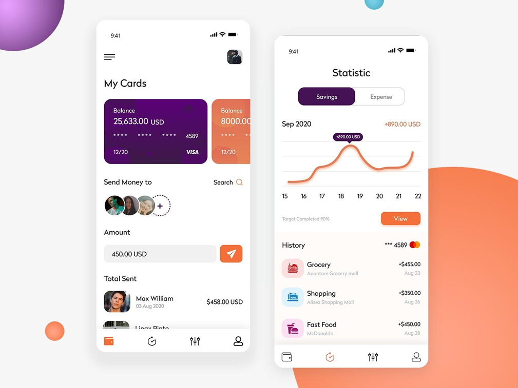
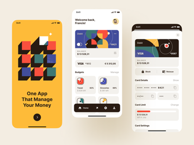
Most users visit their banking apps several times a day to check their balances. Thus, it’s wise and strategically important to make the balance section visible and accessible at a glance.
Give it a central space in the middle of the app’s main screen and give it more visual weight in the UI. You’re sure to notice gains in user loyalty and adoption.
#6 Rely on Visual Cues
Smartphones have much smaller screens than those of desktops and tablets. So, UI designers typically struggle to squeeze all the needed functionality into a small screen. A good solution, in this case, is reliance on visual elements instead of text.
Human psychology can help in this regard, giving people an intuitive feel of the icon’s functionality. For instance, by using a clock or a trash bin icon, you can take advantage of people’s familiarity with the icons and associated functions.
#7 Remove Transfer Frictions
Digital banking comes with many risks, and users don’t want any confusion or uncertainty in this regard. Thus, as a reputable provider, you must ensure that the transaction process is as transparent and simple as possible. Some UI tips are:
● Including all transaction data on one screen,
● Minimize the cognitive load on the user by offering only relevant transaction options,
● Allow auto-fills from the address book to automate transfers
#8 Give Prompts and Confirmations
Users need confirmation that their payment has passed through successfully. Without that prompt, they may be left wondering whether they’ve done everything correctly, with some people even completing double payments.
So, your UI will be much more user-friendly with user prompts and transaction confirmations.
#6 Customize
The best UI is the customizable one today. Users want more control over the UIs they use, and you get an additional competitive advantage by giving them the freedom of setting the layout. Don’t force users to choose; give some standard options for the lazybones and ensure that those who want to play around with design have numerous features for personalization


